No need for a barf bag, though. These peaks and valleys are indeed based in reality, but thankfully a ride on the Tokyo subway is not that rough – at least outside rush hours.

Tokyo’s subway system is one of the most complex in the world – a maze of lines, colors, numbers and names that even locals may have trouble navigating. The combined subway network of the Tokyo and Toei metros comprises 286 stations and 13 lines covering a total system length of 304.0 kilometers (188.9 mi) and carrying a combined average of over eight million passengers daily.
Even compared to large metro networks like the London Underground or the New York City subway, the Tokyo Metro is absolute chaos on paper, making one wonder how it could possibly all run so smoothly day by day.
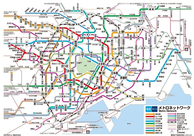
But exactly how do all these lines run underground, overlapping as they carry millions of passengers daily? This is the question graduate student, Takatsugu Kuriyama, wanted to answer by creating a 3D model of Tokyo’s tangled subway system, one which has brightly colored tubes swooping up and down, running over and around each other like the tracks of one of the craziest roller coasters ever.
First unveiled back in 2009, Kuriyama’s 80cm x 80cm model was recently put on display again at the Trans Art Tokyo event and caused quite a sensation on Twitter, with crowds of Japanese social media users sharing photos of the artwork and noting how astonishing they find it.

Photo: Takatsugu Kuriyama
The three-dimensional model filled with colored liquids represents every twist, turn, climb and dip the Metro’s tunnels make in real life. 18 lines are displayed, including 13 subway lines, where white wires stand for stations and their stairs, indicating their depth from the ground to the platform. Each line is a clear tube in which colored water and bubbles flow, with the color corresponding to each line’s color. Bubbles represent train flow, showing how fast trains travel on a specific line within the vast and complicated network.
Oh, and here’s something even more awesome: the shadow of the 3D lines you see on the floor is equivalent to the 2D rail-map!
Quite understandably, there have been some questions raised about the map’s accuracy given the volatile dips and turns. The graphical map below shared by @tokyoreporter was created in 2003 and illustrates the depths of some of the metro lines. As you can see, the two maps share many of the roller coaster characteristics. What we probably see here is that the magnitude of the dips and twirls are being exacerbated when being compressed onto a small plane.


So yes, despite some of the dips looking awfully steep (enough to have the millions of daily passengers on the subway struggle to hold onto their coffee or lunch), this 3D map of the Tokyo metro is indeed impressive stuff and grounded in reality – even the occasional air bubbles look like train cars zipping along the lines.
A great concept altogether.
 Donate


Related Posts
The Road to Heaven: China’s Tianmen Mountain Big Gate Road Might Be the Craziest Drive on Earth
The Woman Who Walked Across a Continent Because She Missed Home: Lillian Alling’s Epic Journey
Castel Meur: The Little House Between the Rocks That Refuses to Be a Tourist Attraction
Every Year, the Sea Parts in Korea for a Short Time—A Natural Event Echoing Moses’ Story
The Vikings’ Legacy: Iceland’s Turf Houses – Hobbit Homes That Vanish Into the Landscape
Chariot Races and Hippodromes: Here Are the Best-Preserved Ones That Take You Right Back to Ancient Roman Times
There’s a Museum in Japan Dedicated to Stones That Look Like Faces: The Hall of Curious Rocks
Finally, a World Map That Gets It Right: The AuthaGraph Projection
Tigres Island – Angola’s Eerie Ghost Town Trapped in Time
Norway’s 800-Year-Old Borgund Stave Church Was Built Entirely of Wood, Using Viking Shipbuilding Techniques