I changed ‘habitability’ to ‘usability’ as I found that’s more like what this map is about. A great example of how capitalists see the world, from 1945.
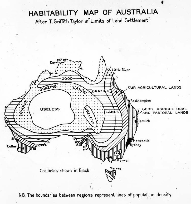
I changed ‘habitability’ to ‘usability’ as I found that’s more like what this map is about. A great example of how capitalists see the world, from 1945.
Earthly Mission is done by two guys driven by the love for what we are doing. Please kindly consider keeping us going – every bit helps!
 Donate
Check out my other project (especially if you're planning to visit Budapest soon) 👇

Donate
Earthly Mission is done by two guys driven by the love for what we are doing. Please kindly consider keeping us going!
DonateSubscribe
Check out my other project (especially if you're planning to visit Budapest soon) 👇

About Earthly Mission


Related Posts
22,000 Years Ago, Aboriginal Miners Descended 70 Metres Into Koonalda Cave to Gather Flint in Complete Natural Darkness
Uluru: The Mysterious Ayers Rock of Australia and the Secrets It Holds Underground
Finally, a World Map That Gets It Right: The AuthaGraph Projection
The Devils Marbles: The Mystique of Australia’s Balancing Act of Nature
Tabula Peutingeriana: The Most Extensive Surviving Map of the Roman Empire Is the Only One to Show Its Vast Road Network
The World’s Tallest Sea Stack Is Home to the World’s Rarest Insect, Which Exhibits a Highly Unusual Behavior
This Is the Oldest Known Map of the World, Made in Babylon About 2,600 Years Ago
Nightmare Fuel Around the World: What “Boogeyman” Looks Like in Different Countries
World’s Most Dangerous Bird Pays Surprise Visit to Local Carpenter Shop in Australia
This Interactive Map Shows You What Native Land You’re Living On